
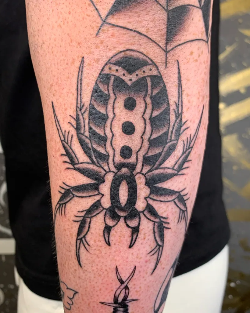
Engraving: medieval elegance
A style drawn from the engravings in old books and on coins. How tone is made out of lines alone, and what that means for the way a tattoo ages.
Where engraving came from
Engraving is not originally a tattoo style at all. It is a printing technique
used from the fifteenth century onwards — the engraver cut an image into a copper plate, the plate
was inked and pressed onto paper. That is how book illustrations, scientific atlases, portraits and
banknotes were made.
The engraver had one colour and one tool. Tone, shadow and volume all had to be built out of the
density and direction of lines. That exact way of thinking is what engraving
brought into tattooing.
How tone is made out of lines
In engraving there is no “grey”. There is a black line and the skin between the lines. A lighter
area means the lines are further apart, a darker one that they are closer. The engraver’s
techniques have their own names:
- Hatching — parallel lines running one way.
- Cross-hatching — two sets of lines laid across each other, for darker areas.
- Stippling — a soft transition where lines would read as harsh.
- Following the form — lines curve with the surface of the object, so they suggest volume on their own.
That last one is what makes engraving engraving. When the lines on a sphere run across its surface
rather than straight, the eye sees a sphere with no shading at all.
Which motifs suit it
Engraving likes things with a clear structure and a surface:
- Plants, flowers and branches — anywhere the veining can be followed.
- Animals with distinct fur or feathers.
- Objects — a gramophone, a lamp, a compass, a book, coins.
- Architecture and geometry.
- Anatomy and skulls in the spirit of the old atlases.
Soft, formless things — smoke, mist, water — work less well. They have no surface for a line to
travel across.
How engraving ages, and what follows from that
Here I have to be straight with you. Of the styles I do, engraving is the
most sensitive to time. When the lines sit too close together, they merge over the
years and fine hatching turns into a solid grey field.
So with engraving I do two things:
- I do not draw it too tight. I would rather the result read lighter and still look like an engraving in ten years.
- I do not do it too small. A motif under 10 cm has no room for the hatching to show at all.
If somebody promises you a coin-sized engraving with ten levels of tone, be careful. It will look
superb for the first year.
Where it suits
Best on the forearm, the calf and the thigh — even areas without much skin movement. Less suited to
fingers, wrists and ankles, where a fine line wears faster.
Combining it with other styles
Engraving sits surprisingly well with ornamental patterns and
with dotwork. Next to a solid traditional motif it
looks a little lost — one is built on fields of colour, the other on lines.
If engraving interests you, have a look at the What else I do page,
where it sits alongside dotwork and ornamental.